
Why UltraPlot?#
Matplotlib is an extremely versatile plotting package, but it is cumbersome and repetitive for users who make complex figures with many subplots, finely tune their annotations, or need new figures nearly every day. UltraPlot’s core mission is to smooth out the plotting experience for matplotlib’s most demanding users. It does this by expanding upon matplotlib’s object-oriented interface with changes that would be hard to justify inside matplotlib itself.
The sections below pair the “before” – a plain matplotlib result – with the “after” – the same plot made with UltraPlot – so you can see the difference at a glance. For the full user guide, see the usage introduction and the user guide.
Less typing, more plotting#
In matplotlib, changing many plot settings at once means calling a series of
one-liner setter methods – and it is often unclear whether a property lives on
the Axes, the XAxis,
a Spine, or tick_params().
UltraPlot replaces all of this with the format()
command: an expanded, thoroughly documented version of
update() that can also apply rc settings and integrate with the constructor functions.
The figure-level format() and
format() commands format several subplots
at once.
import ultraplot as uplt
fig, axs = uplt.subplots(ncols=2)
axs.format(color='gray', linewidth=1)
axs.format(xlim=(0, 100), xticks=10, xtickminor=True, xlabel='foo', ylabel='bar')
is much more succinct than…
import matplotlib.pyplot as plt
import matplotlib.ticker as mticker
import matplotlib as mpl
with mpl.rc_context(rc={'axes.linewidth': 1, 'axes.edgecolor': 'gray'}):
    fig, axs = plt.subplots(ncols=2, sharey=True)
    axs[0].set_ylabel('bar', color='gray')
    for ax in axs:
        ax.set_xlim(0, 100)
        ax.xaxis.set_major_locator(mticker.MultipleLocator(10))
        ax.tick_params(width=1, color='gray', labelcolor='gray')
        ax.tick_params(axis='x', which='minor', bottom=True)
        ax.set_xlabel('foo', color='gray')
Links#
Class constructor functions#
Matplotlib and cartopy define verbose class names like
MultipleLocator and
LambertAzimuthalEqualArea, and keep them out of the
top-level namespace. UltraPlot instead “registers” tick locators, tick
formatters, axis scales, property cycles, colormaps, normalizers, and cartopy
projections, so you can refer to them with constructor functions and short
names:
A scalar passed to
Locatorreturns aMultipleLocator; a list of strings passed toFormatterreturns aFixedFormatter.ColormapandCycleaccept registered names, individual colors, and lists of colors.Every registered class is also available directly in the top-level namespace, e.g.
uplt.MultipleLocator(...)oruplt.LogNorm(...).
The table below lists the constructor functions and the keyword arguments that use them.
Links#
For more on axes projections, see this page.
For more on axis locators, see this page.
For more on axis formatters, see this page.
For more on axis scales, see this page.
For more on datetime locators and formatters, see this page.
For more on colormaps, see this page.
For more on normalizers, see this page.
For more on color cycles, see this page.
Automatic dimensions and spacing#
Matplotlib
import matplotlib.pyplot as plt
import numpy as np

x = np.arange(10)
y = np.random.default_rng(0).normal(size=(4, 10))
fig, axs = plt.subplots(2, 2)
for i in range(2):
   for j in range(2):
      axs[i, j].plot(x, y[i, :] * (i + 1) + j + 0.25 * x)
      axs[i, j].set_title(
         "A long title that collides with neighboring labels",
         fontsize=10,
      )
      axs[i, j].set_xlabel("x axis", fontsize=10)
      axs[i, j].set_ylabel("y axis", fontsize=10)
(Source code, svg)
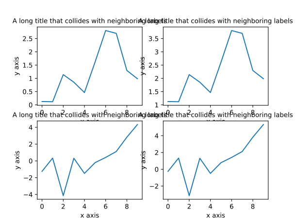
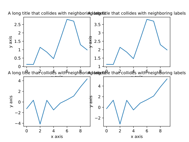
The figure size is fixed, the margins are tuned by hand, and the bottom-row titles collide with the tick labels above them. Add a subplot or change the font size and the whole thing needs retuning.
UltraPlot
import numpy as np
import ultraplot as uplt

x = np.arange(10)
y = np.random.default_rng(1).normal(size=(4, 10))
fig, axs = uplt.subplots(
   nrows=2,
   ncols=2,
)
for ix in range(2):
   for jx in range(2):
      axs[ix, jx].plot(x, y[ix, :] * (ix + 1) + jx + 0.25 * x)

axs.format(
   xlabel="x",
   ylabel="y",
   title="Automatic spacing across subplot groups",
   abc="A.",
   abcloc="ul",
)
(Source code, svg)
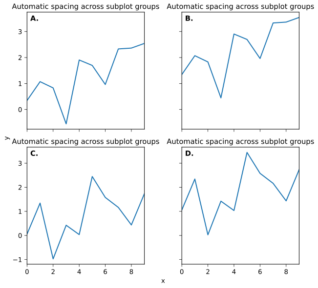
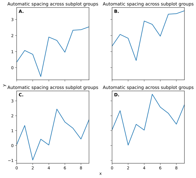
UltraPlot fixes the physical dimensions of a reference subplot (refwidth,
refheight, refaspect) instead of the figure, so subplot size – and the
apparent size of text – stays constant no matter how many subplots you add.
Its own tight layout algorithm then handles the spacing.
Links#
Working with multiple subplots#
Matplotlib
import matplotlib.pyplot as plt
import numpy as np

x = np.arange(5)
fig, axs = plt.subplots(2, 2)
for i in range(2):
   for j in range(2):
      axs[i, j].plot(x, x * (i + 1) + j, label=f"line_{i}_{j}")
      axs[i, j].set_xlabel("x")
      axs[i, j].set_ylabel("y")
      axs[i, j].set_title("Panel label")
fig.legend(loc="upper right", ncol=1, frameon=False)
(Source code, svg)
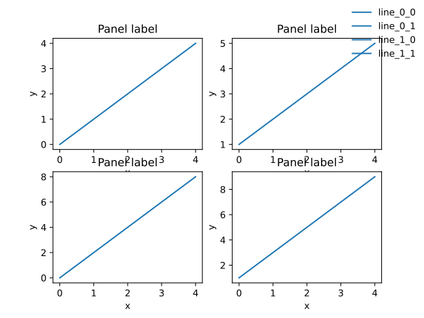
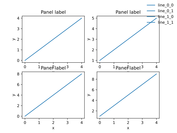
Every subplot repeats its own tick labels and axis labels, wasting page space. Adding “a-b-c” labels – required for most publications – is entirely manual.
UltraPlot
import numpy as np
import ultraplot as uplt

x = np.arange(5)
fig, axs = uplt.subplots(nrows=2, ncols=2)
for idx, ax in enumerate(np.ravel(axs), start=1):
   ax.plot(x, x * ((idx % 2) + 1), label=f"line_{idx}")
axs.format(xlabel="x", ylabel="y", abc=True)
fig.legend(loc="r", ncol=1, frameon=False)
(Source code, svg)
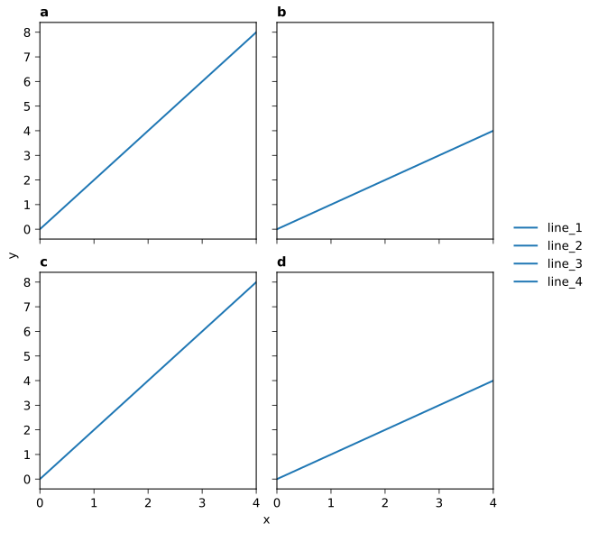
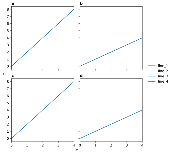
Tick labels and axis labels are shared and aligned automatically (sharex,
sharey, spanx, spany), and a-b-c labels are added with a single
rc.abc setting, e.g. axs.format(abc='A.').
Links#
Simpler colorbars and legends#
Matplotlib
import matplotlib.pyplot as plt
import numpy as np

data = np.linspace(0, 1, 200).reshape(20, 10)
fig, axs = plt.subplots(1, 2)
for i in range(2):
   m = axs[i].imshow(data * (i + 1), aspect="auto")
   axs[i].set_title("Left" if i == 0 else "Right")
   if i == 0:
      fig.colorbar(m, ax=axs[i])
(Source code, svg)
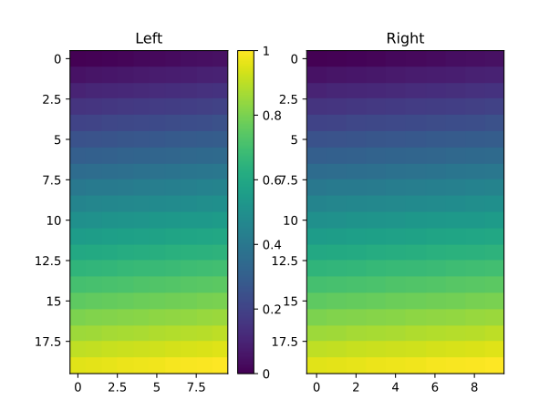
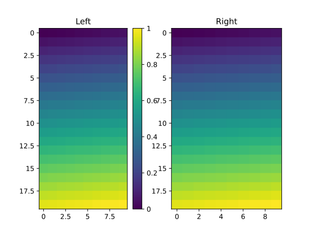
Drawing a colorbar with fig.colorbar(m, ax=ax) steals space from the
parent subplot – here the left panel is visibly narrower than the right
one. Outer legends have to be positioned by hand and tweaked to fit.
UltraPlot
import numpy as np
import ultraplot as uplt

data = np.linspace(0, 1, 200).reshape(20, 10)
fig, axs = uplt.subplots(ncols = 2)
for idx, ax in enumerate(np.ravel(axs), start=1):
   m = ax.imshow(data * idx)
   fig.colorbar(m, ax=ax, loc="r", width="6mm")
axs.format(title=["Left", "Right"])
(Source code, svg)
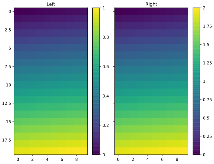
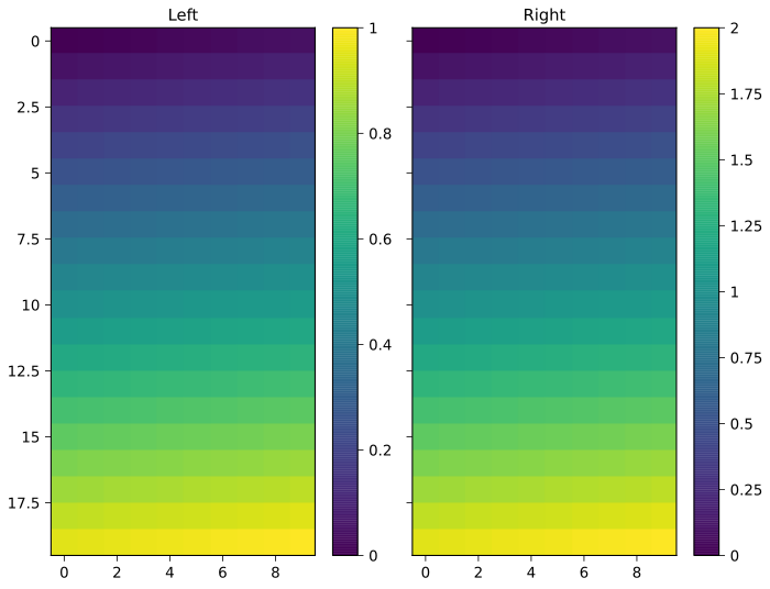
Colorbars and legends get their own space in the
GridSpec – the subplots keep their exact
dimensions. Outer (loc='l') and inset (loc='ur') locations work for
both, and colorbar widths are specified in physical units.
Links#
Improved plotting commands#
Matplotlib
import matplotlib.pyplot as plt
import numpy as np

x = np.linspace(0, 2 * np.pi, 200)
y = np.sin(x)
fig, ax = plt.subplots()
ax.fill_between(x, 0, y)
ax.plot(x, y, color="black")
ax.set_title("Single fill color for pos/neg regions")
(Source code, svg)
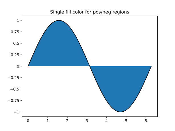
Filling under a curve means writing fill_between()
yourself, and the obvious call paints the positive and negative regions the
same color. Differentiating the sign requires where= bookkeeping by hand.
UltraPlot
import numpy as np
import ultraplot as uplt

x = np.linspace(0, 2 * np.pi, 200)
y = np.sin(x)
fig, ax = uplt.subplots()
ax.area(x, y, negpos=True)
ax.format(title="Automatic negative/positive fills")
(Source code, svg)
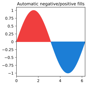
ax.area(x, y, negpos=True) colors the positive and negative regions
automatically. The PlotAxes commands bundle many
such seaborn- and xarray-style conveniences, including
standardized data arguments,
on-the-fly colorbars and legends, and
error bars and shading.
Links#
Cartopy and basemap integration#
Matplotlib
import matplotlib.pyplot as plt
import numpy as np

x = np.arange(0, 360, 10)
y = np.arange(-90, 100, 10)
X, Y = np.meshgrid(x, y)
Z = np.sin(np.deg2rad(X)) * np.cos(np.deg2rad(Y))
fig, ax = plt.subplots()
pcm = ax.pcolormesh(X, Y, Z, cmap="viridis")
plt.colorbar(pcm, ax = ax, location = "top")
ax.set_title("Hand-built pseudo map with manual gridline work")
(Source code, svg)
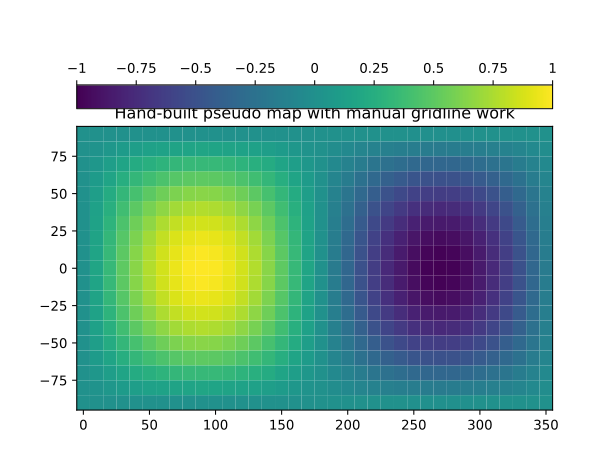
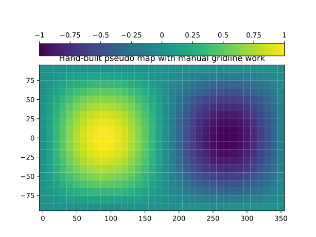
Building a map with cartopy or basemap means importing a separate package, configuring the projection, and adding gridlines and labels line by line. Longitude-latitude (“Plate Carrée”) data has to be converted to map coordinates by hand.
UltraPlot
import numpy as np
import ultraplot as uplt

x = np.arange(0, 360, 10)
y = np.arange(-90, 100, 10)
X, Y = np.meshgrid(x, y)
Z = np.sin(np.deg2rad(X)) * np.cos(np.deg2rad(Y))
fig, ax = uplt.subplots(proj="pcarree")
ax.pcolormesh(X, Y, Z,
       cmap="batlow",
       colorbar = "r",
       colorbar_kw = dict(label = "Value"),
)
ax.format(lonlabels="b", latlabels="l")
(Source code, svg)
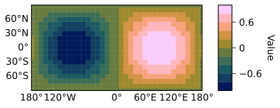
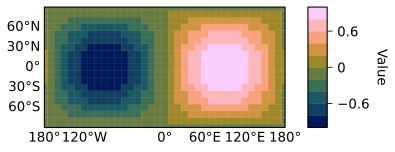
A geographic plot is uplt.subplots(proj='pcarree'). The
GeoAxes subclass unifies cartopy and basemap,
defaults to longitude-latitude coordinates, and exposes gridlines, labels,
coastlines, and borders through the same format()
command used elsewhere.
Links#
Pandas and xarray integration#
Matplotlib
import matplotlib.pyplot as plt
import numpy as np
import pandas as pd

rng = np.random.RandomState(0)
data = (rng.normal(size=(12, 18)).cumsum(axis=1).cumsum(axis=0))
df = pd.DataFrame(
   (data - data.min()) / (data.max() - data.min()),
   index=pd.date_range("2026-01-01", periods=12, freq="MS"),
   columns=np.arange(18),
)

fig, ax = plt.subplots()
image = ax.imshow(df.to_numpy(), cmap="viridis", aspect="auto")
fig.colorbar(image, ax=ax)
ax.set_title("Matplotlib treats metadata as plain arrays")
ax.set_xlabel("generic x")
ax.set_ylabel("generic y")
(Source code, svg)
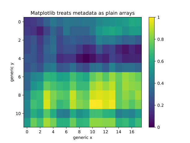
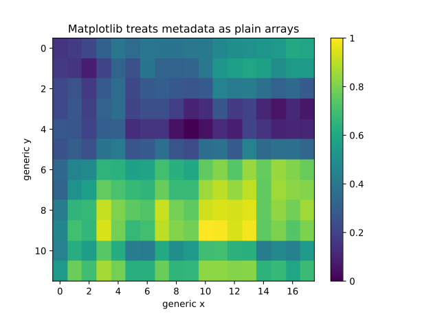
Matplotlib treats a DataArray or DataFrame
as a plain array and ignores its metadata – so no legend, no title, and
generic axis labels. Getting the metadata into the figure means switching to
the .plot methods and learning a second syntax.
UltraPlot
import pandas as pd
import numpy as np
import ultraplot as uplt

rng = np.random.RandomState(0)
df = pd.DataFrame(
   (rng.normal(size=(12, 18)).cumsum(axis=1).cumsum(axis=0) - 1),
   index=pd.date_range("2026-01-01", periods=12, freq="MS"),
   columns=np.arange(18),
)
df.name = "temperature (\N{DEGREE SIGN}C)"
df.index.name = "month"
df.columns.name = "variable"

fig, ax = uplt.subplots()
cs = ax.contourf(df, cmap="batlow", colorbar="t")
fig.colorbar(cs, ax=ax, loc="r", width="6mm")
(Source code, svg)
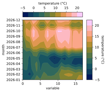
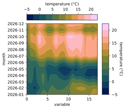
The same data plotted with UltraPlot is labeled automatically: the axis
labels, subplot title, and colorbar and legend labels are all taken from the
metadata. Quantity units are handled too. Disable with
autoformat=False.
Links#
Aesthetic colors and fonts#
Matplotlib
import matplotlib.pyplot as plt
import numpy as np

x = np.linspace(-4, 4, 180)
y = np.linspace(-4, 4, 180)
X, Y = np.meshgrid(x, y)
Z = np.exp(-(X**2 + Y**2) / 4) * np.cos(X * 2) * np.sin(Y * 2)

fig, ax = plt.subplots()
ax.pcolormesh(X, Y, Z, cmap="jet")
ax.set_title("A misleading 'jet' colormap")
ax.set_xlabel("x")
ax.set_ylabel("y")
(Source code, svg)
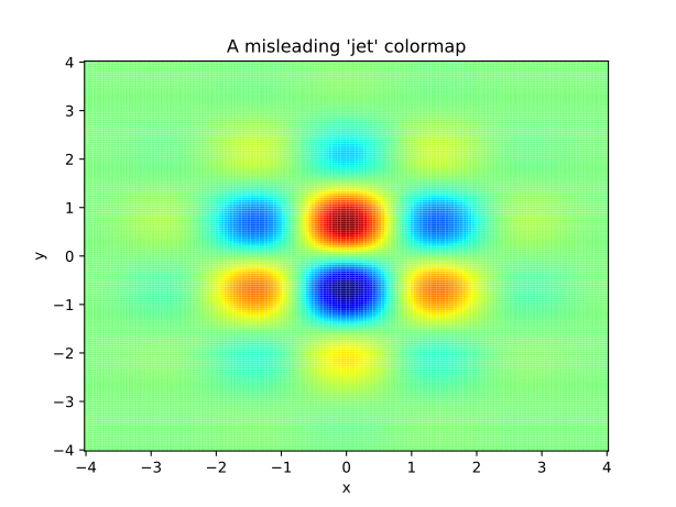
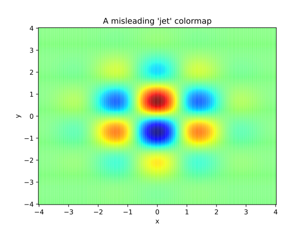
“Misleading” colormaps like 'jet' have jarring jumps in hue,
saturation, and luminance that can trick the eye into seeing patterns that
are not there (rainbow). The default DejaVu font is functional but not
particularly elegant.
UltraPlot
import numpy as np
import ultraplot as uplt

x = np.linspace(-4, 4, 180)
y = np.linspace(-4, 4, 180)
X, Y = np.meshgrid(x, y)
Z = np.exp(-(X**2 + Y**2) / 4) * np.cos(X * 2) * np.sin(Y * 2)

fig, ax = uplt.subplots()
ax.pcolormesh(X, Y, Z, cmap="batlow")
ax.format(title="Perceptually uniform batlow colormap")
(Source code, svg)
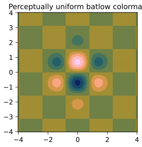
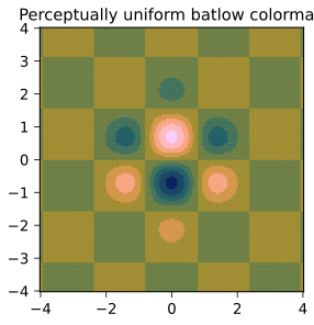
UltraPlot ships “perceptually uniform” colormaps from the seaborn,
cmocean, SciVisColor, and
Scientific Colour Maps projects (here, 'batlow'), plus the
TeX Gyre font series, the open color palette,
and filtered XKCD color survey names.
Links#
Manipulating colormaps#
Matplotlib implements colormaps with
LinearSegmentedColormap and
ListedColormap, which are cumbersome to modify or
create from scratch. UltraPlot makes colormaps and property cycles easy to
work with:
All colormaps are replaced with the
ContinuousColormapandDiscreteColormapsubclasses, adding the features used by theColormapandCycleconstructor functions.Colormapcan merge, truncate, and modify existing colormaps, or generate brand-new ones – includingPerceptualColormaps with linear transitions in hue, saturation, and luminance rather than red, green, and blue.Cyclecan build property cycles from scratch, from registeredDiscreteColormapinstances, or by splitting up the colors from continuous colormaps.Colormap and cycle names are case-insensitive, and appending
'_r'or'_s'reverses or cyclically shifts them.
Links#
Physical units engine#
Matplotlib expresses margins in figure-relative units and spacing in axes-relative units, so changing the figure size forces you to re-tune the numbers. UltraPlot instead uses physical units everywhere:
The
GridSpeckeywordsleft,right,top,bottom,wspace,hspace,pad,outerpad, andinnerpadaccept physical units, defaulting toem-widths– plot text is a useful “ruler” for spacing.The
Figurekeywordsfigsize,figwidth,figheight,refwidth, andrefheightaccept arbitrary string units such as inches, centimeters, millimeters, pixels,points, andpicas(see the units table).This is powered by the
units()engine, which also translates rc settings assigned torc_matplotlib()andrc_UltraPlot.
Links#
Flexible global settings#
In matplotlib, several rcParams are only useful if changed
all at once – like spine and label colors – and they cannot be changed for
individual subplots. UltraPlot provides a single rc
object for both native matplotlib settings
(rc_matplotlib) and UltraPlot’s own settings
(rc_UltraPlot):
Assigned settings are always validated, and “meta” settings like
meta.edgecolorandmeta.linewidthupdate many settings at once.Settings can be changed with
uplt.rc.key = value,uplt.rc[key] = value,uplt.rc.update(key=value),format(), or thecontext()context manager.Settings changed during a session can be saved with
save()and loaded withload().
Links#
Loading stuff#
Matplotlib makes persistent configuration awkward, and there is no built-in way to register your own colormaps, color cycles, or fonts. UltraPlot turns this into dropping files into folders:
Edit the default
ultraplotrcfile (usually$HOME/.ultraplot/ultraplotrc) or add looseultraplotrcfiles to the current directory or a parent directory to change settings persistently.Colormaps, color cycles, colors, and fonts stored in subfolders named
cmaps,cycles,colors, andfontsinsideuser_folder()(usually$HOME/.ultraplot) are registered automatically – as are looseultraplot_cmaps,ultraplot_cycles,ultraplot_colors, andultraplot_fontsfolders in the current or a parent directory.Pass
save=TruetoColormapandCycleto save new colormaps and cycles, or useregister_cmaps(),register_cycles(),register_colors(), andregister_fonts()to register arbitrary inputs during a session.